

You've arranged the faux tulips on the shelf, stepped back, and liked what you saw. Then you walked past them in daylight and noticed the hard shine on the petals, the identical flower heads lined up at the same height, and one leaf folded into a factory crease. From across the room, the vase works. Up close, it announces itself as plastic.
Learning how to make faux flowers look real isn't mainly about buying more stems. It's about removing the signals that make them look manufactured, then checking the finished arrangement under the light and viewing angles your home actually uses. A convincing display needs believable materials, irregular structure, restrained color, and enough empty space for the eye to read it as a plant rather than a bundle of objects.
Table of Contents
- Why Most Faux Arrangements Still Look Fake
- Choosing Stems That Already Look Believable
- Reshaping and Finishing Individual Blooms
- The Staged Assembly Method for the Vase
- The Room-by-Room Realism Test
- Cleaning, Repair, and Sustainable Use
- The 30-Minute Realism Checklist Before Guests Arrive
Why Most Faux Arrangements Still Look Fake
The usual advice is sound but incomplete. Bending stems and varying heights help, but they can't rescue a flower with a reflective surface, flat color, or leaves that all face the same direction. Realism is layered. The material has to respond plausibly to light, the bloom needs some variation, and the arrangement must avoid the repeated geometry produced by factory assembly.
Victorian flower-makers understood that detail mattered. In London, makers dyed fabric, shaped petals, and pressed leaves in specialized molds to reproduce veins and surface texture. The London Museum's history of artificial flower-making notes that the 1891 census recorded 4,011 flower-makers in London, evidence of a substantial skilled industry. Their work also shows why a finished spray or wreath can look more convincing than a perfect isolated bloom. Composition carries as much realism as construction.
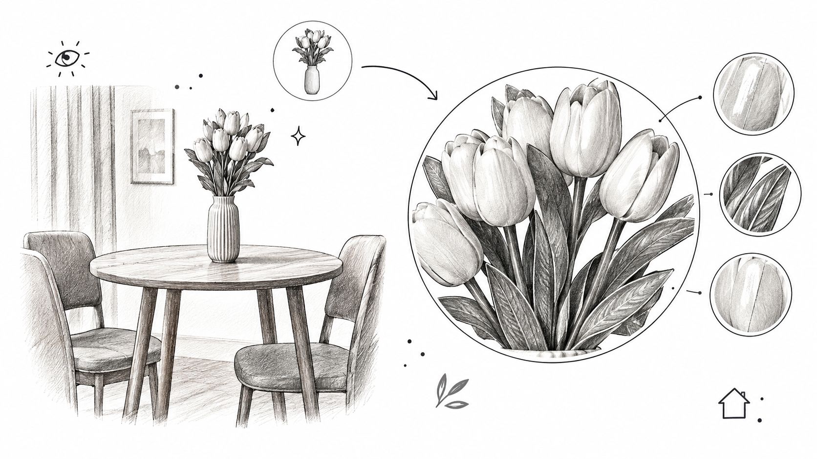
The close-up clues that give them away
Look at the arrangement from normal room distance first. If it works there, move closer and check the details that distance hides:
- Reflective surfaces: Hard gloss catches a sharp highlight that living petals rarely produce across the whole bloom.
- Repeated geometry: Identical flowers at identical heights create a pattern, not a plant.
- Flat color: One saturated shade across every petal makes the material look dyed in one pass.
- Rigid direction: Leaves and stems that point straight up or sit at identical angles feel assembled.
- Overpacked heads: Dense filling hides the stems and foliage that give a bouquet its natural structure.
The target isn't botanical perfection. A slightly imperfect arrangement often looks more believable than a dense, polished one because natural plants contain variation in opening, direction, size, and spacing. Your job is to remove the loudest artificial cues, not to paint every vein on every leaf.
Practical rule: If a bloom only looks convincing from one side, it isn't finished. Rotate it, reshape it, or replace it.
Choosing Stems That Already Look Believable
Start with the stem, not the vase. A cheap artificial flower with a workable surface and bendable wire can improve considerably, while a rigid, glossy bloom may never pass a close inspection no matter how carefully you arrange it.
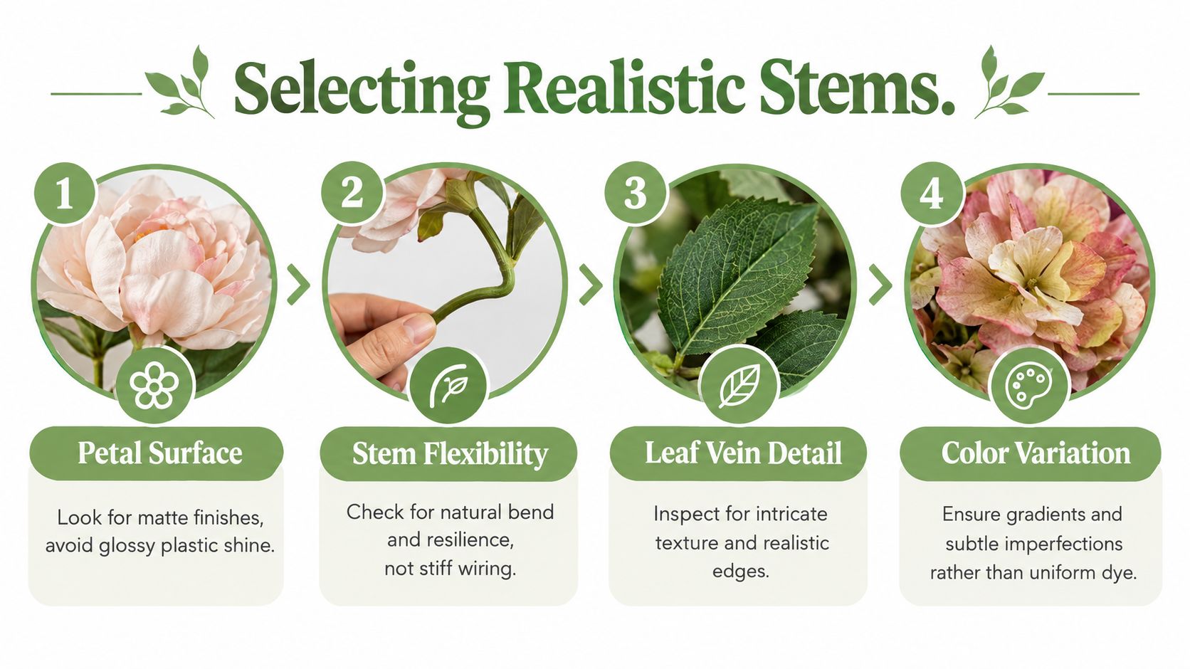
Run a quick four-point inspection
Petal surface comes first. Hold the bloom under ordinary overhead light and turn it slowly. Matte or softly translucent petals usually look more natural than uniformly shiny plastic. A small highlight is acceptable. A broad, candy-like reflection across every petal is a warning.
Test the stem with your fingers. A useful stem should bend into a gentle arc and hold that shape without looking kinked. Excessively stiff wiring limits the irregular movement that makes a spray look alive. If the stem snaps straight back or feels like a molded rod, skip it unless the flower is intended for a rigid architectural display.
Inspect leaves at close range. Look for raised veins, uneven edges, and a surface that doesn't reflect light like a smooth sheet. Identical leaves with identical folds make even good flowers look mass-produced.
Study the color transition. Natural-looking petals often have some center-to-edge variation, a darker throat, or a quiet shift between overlapping layers. Avoid blooms where every petal has exactly the same flat shade. Species-appropriate proportions matter too. A rose with oversized petals and a tiny center, or a tulip with an implausibly thick head, will look wrong before you've touched the stem.
Material changes the result. Silk and high-grade polyester suit petals that need a soft, matte appearance while retaining shape. Latex and polyurethane real-touch finishes can offer a more convincing tactile surface and molded detail. Polyester also accepts dye and adhesive well, which makes it practical for small finishing adjustments. None of these materials guarantees realism, because shine, molding, color, and construction still have to work together.
For a nearby decorative reference, floral canvas wall art can help you compare silhouettes, petal placement, and color relationships before buying stems. A painted or printed floral image is useful for judging whether a faux arrangement has believable proportions, even though it won't reproduce surface texture.
What to leave on the shelf
Skip visible mold seams, leaves with razor-smooth edges, rigid PVC-like stems, and petals crushed into permanent factory folds. Also avoid buying a large bundle just because the price feels convenient. A smaller group with varied flower stages and credible foliage will usually give you more control.
For seasonal styling ideas that pair color and shape before you shop, browse these spring floral arrangement ideas. Use them as a composition reference, not as a reason to copy every stem count or silhouette.
Reshaping and Finishing Individual Blooms
A promising stem often arrives flattened, too symmetrical, or overly bright. Fix it before arranging. Once several flawed blooms are packed into a vase, it becomes harder to tell which surface, crease, or color problem is making the whole display look artificial.
Finish in the right order
- Compare before changing anything. Use a real reference photo or specimen of the same flower. Study how the petals open, where the color deepens, and how the leaves attach. Don't add details just because they look decorative.
- Correct the silhouette. Gently bend petals or use mild heat only when the material allows it. Keep heat away from unknown plastics, adhesives, and delicate coated fabrics. Shape one or two petals differently from the others rather than curling every edge.
- Check the gloss. Place the bloom near a window and rotate it. If the surface throws a hard, continuous reflection, soften or replace it. Don't automatically seal a painted flower, because many sealants create the glossy film you were trying to remove.
- Add restrained tonal variation. Diluted acrylic or compatible fabric paint can deepen the throat and soften the outer edges. Build color gradually with a small brush or sponge. One uneven pass is more believable than a perfectly blended airbrushed finish.
- Reproduce selected structure. Add a few veins, a calyx, pollen zones, or stem nodes where they help the flower read correctly. Painting every surface creates a craft-project look.
- Vary the opening. Bend one petal outward, leave another closer to the center, and turn the bloom slightly away from the viewer. Natural variation comes from direction as much as color.
The guide to wick blooms from Jackpot Candles is a useful reminder that small organic-looking forms can emerge from uneven growth and buildup. Apply that principle carefully. You're looking for irregularity with structure, not random damage.
Two tests catch most finishing problems
The crease test uses side light. Put the flower near a window or under a lamp and look across the petal rather than straight at it. A pressed fold will cast a sharp, unnatural line and usually needs reshaping or retirement.
The touch test checks whether the surface feels soft, flexible, and consistent with the flower you're imitating. If the bloom looks accurate but feels rigid and slippery, don't compensate with more paint. Change the stem or place it where guests won't handle it.
The Staged Assembly Method for the Vase
A natural arrangement doesn't begin with every stem at one height. Build it in layers so the eye sees a loose plant structure, not a row of manufactured heads.
Build three height zones
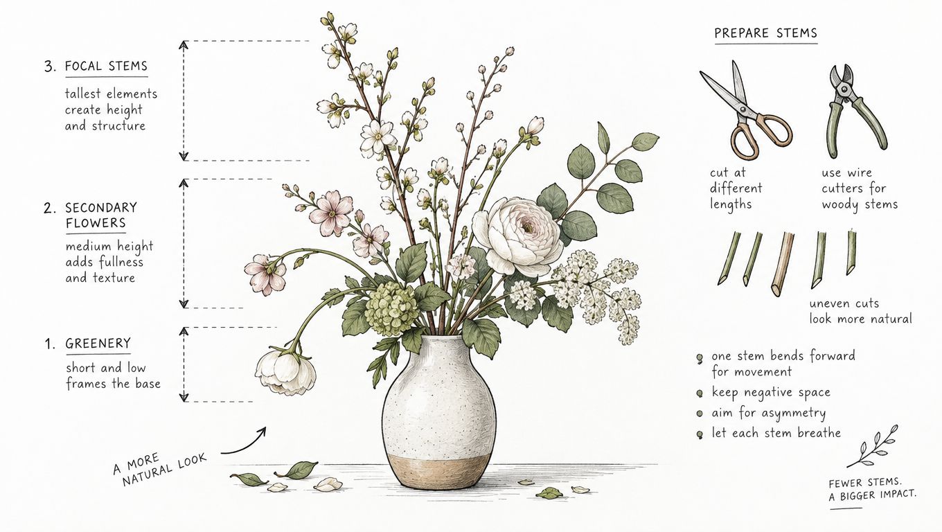
Start with a short greenery base. Place leaves low and slightly forward, then push a few pieces sideways so the outline doesn't form a neat circle. This foliage creates a transition between the vase and the flowers.
Add medium secondary flowers next. These should sit at different depths, with some heads closer to the rim and others tucked behind the greenery. Trim wired stems to several lengths instead of cutting them all to match. If the vase is opaque, bend excess wire inside it. For clear glass, use a wire cutter and keep the visible stems clean.
Finish with taller focal stems. Give the strongest bloom the most convincing line, but don't place every focal head at the same level. Bend one stem outward, another slightly downward, and leave a small gap between the tallest heads. A single irregular arc can do more for realism than adding several identical flowers.
Natural-looking asymmetry needs intention. One lower bud and one forward leaf usually work better than random bending everywhere.
Leave room around the flower heads
Negative space lets each bloom retain its identity. If you fill the vase until stems and foliage disappear, the display becomes a solid mass and the repeated petals become easier to spot. Small apartments benefit especially from a compact arrangement with three clear zones, because it creates depth without requiring a large quantity of material.
Before placing it on a dining table, check the silhouette from the main entrances to the room. A centerpiece should look balanced from more than one seat, but it doesn't need to be symmetrical. These dining table centerpiece ideas can help you judge scale and sightlines while you keep the arrangement loose.
Turn the vase a quarter turn and inspect again. If the same two flowers dominate every angle, rotate or lower one. If the arrangement collapses from the side, add a bent branch or move greenery forward rather than stuffing in another bloom.
The Room-by-Room Realism Test
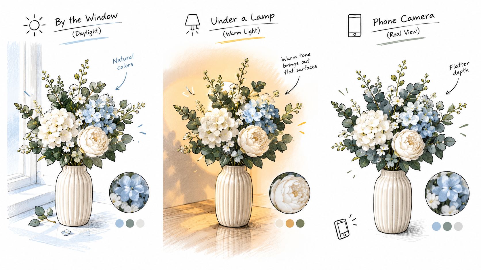
A stem that looks convincing in a shop can fail in your apartment because light exposes different weaknesses. Test the arrangement where it will live, at the time of day you'll see it. This is the practical difference between decorating from across the room and checking whether the display survives inspection.
Diffuse daylight near a window
Daylight reveals flat color, glossy petals, factory creases, and identical leaves. Set the vase near a window without placing it in harsh direct sun, then look from the doorway and from close range. If every petal reflects at once, the material is too shiny or the angle is wrong. If one side looks dead, rotate the arrangement so the strongest foliage catches soft light.
Don't repaint a flower when the actual problem is placement. A slight turn can move a reflective surface out of the brightest area. If the color still looks unnaturally uniform, tone the center or retire that bloom.
Warm lamps after dark
Warm light exaggerates flat surfaces and can make yellow, cream, and blush petals appear muddy. Check whether the arrangement still has depth when shadows fall between petals. A flower that depends on subtle daylight variation may disappear under a lamp, while a high-gloss bloom can become even more conspicuous.
Use a small adjustment first. Pull one leaf forward, separate two overlapping heads, or turn a bloom toward the softer edge of the light. If the petals remain visibly plastic, move that stem to a less prominent room instead of forcing it to perform in unsuitable lighting.
The phone-camera check
Your phone camera flattens depth and makes repetition easy to spot. Take a normal room-distance photo, then one close enough to show the petals. Look for heads lined up on one plane, dark gaps caused by overpacking, and leaves that vanish into the background.
A photo also exposes scale problems that your eyes forgive. If the flowers look oversized for the vase or the arrangement appears like a tight cluster, reduce rather than add. For further placement ideas, compare the display with these coffee table decor ideas, especially if the vase sits where people view it from several directions.
A bloom that fails every lighting condition isn't a styling challenge. It's a candidate for replacement.
Cleaning, Repair, and Sustainable Use
Faux flowers still need care. Dust collects on textured leaves and matte petals, especially near kitchens and in rooms with little airflow. Use a dry microfiber cloth, a soft makeup brush, or low-pressure air held away from glued parts. For washable polyester, test a barely damp cloth on a hidden area first. Let every piece dry completely before placing it back in the vase.
Set the cleaning schedule by location. Kitchen-adjacent displays usually need attention sooner than living-room arrangements, while high shelves can wait until dust shows. Avoid soaking foam-heavy designs or scrubbing coated fabric. Water may loosen adhesive, stain dye, or deform internal supports.
A small repair can preserve a believable stem. Reattach a loose leaf with suitable adhesive, rewire a leaning stem if its internal structure permits, and replace only the bloom that fails close inspection. If a stem still looks glossy, flattened, or wrong under the room's lighting after repair, retire it rather than hiding it in a prominent arrangement.
Reuse containers and keep sound stems in circulation through storage, donation, or repurposing. Faux flowers are not automatically the greener option, especially when their construction depends heavily on foam. Research on floral materials found that traditional phenol-formaldehyde floral foam can break down into microplastics, while tested basalt-fiber alternatives maintained more than seven days of vase life for all flowers studied. That research concerns fresh-flower design, but it supports a practical rule for faux arrangements: avoid unnecessary foam-heavy construction and repair usable stems before replacing them.
The 30-Minute Realism Checklist Before Guests Arrive
More flowers won't automatically make a display look real. In a small apartment, excess stems usually create a crowded silhouette, hide the foliage, and repeat the same manufactured shapes. A smaller arrangement with varied openings, a little empty space, and one or two imperfect arcs reads more naturally.
Use the half hour for corrections with the biggest visual payoff:
- Dust the visible surfaces. Brush petals and leaves, then wipe the vase.
- Run the daylight or lamp check. Turn the vase and identify the harshest reflection.
- Bend two or three stems. Send one outward, one slightly down, and keep one upright.
- Pull greenery forward. Break the outer silhouette with a leaf or branch.
- Separate repeated heads. Lower one bloom or move it deeper into the arrangement.
- Take a phone photo. Replace any flower that still looks flat, glossy, or oversized.
- Remove one stem if the vase feels crowded. Space is often the final improvement.
Treat faux flowers as a small craft, not a shortcut. When a stem can't survive the room's light, viewing distance, and close inspection, retire it discreetly. The arrangement will look better with fewer believable pieces than with a full vase of flowers you're constantly trying to explain away.
Quiet Joy At Home offers practical home decor, gardening, and small-space lifestyle guides for renters and budget-conscious hosts. Visit Quiet Joy At Home for more approachable styling ideas, seasonal inspiration, and room-by-room projects you can actually finish.
Generated with Outrank tool